Wanna hit the mark? Less is more
Subtraction, simplicity, clean lines, pastel colored empty spaces, silhouettes, scale contrasts. Maybe, toning it down
really is the key.
It seems easy but it isn’t. Summarising and paring everything down to the essential is a skill and it must be practiced,
not everyone was born with it.
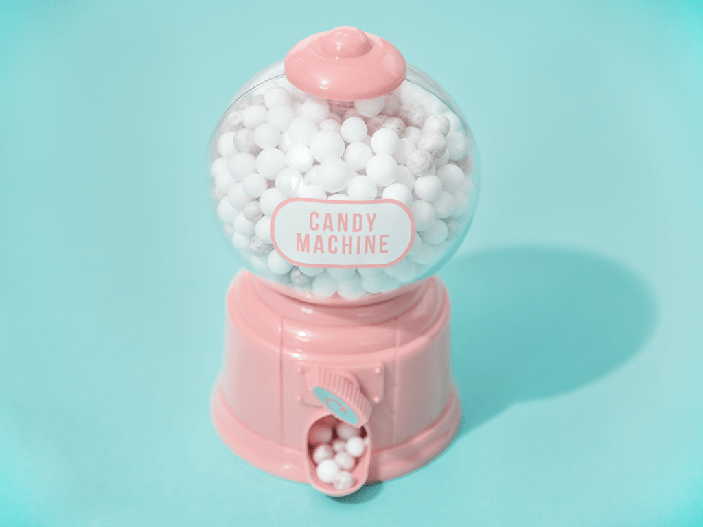
1. Soft Colors
The first option is using soft colors to fill the empty spaces in which the main subject is located so that it stands out.
In this way the customer will surely spot it with no difficulty. The visual inputs that characterise the setting will
make it easy for the object to be noticed.
2. Monochromatic Scenes
Pictures which are characterised by one single color and all of its shades have a strong impact.
While looking at them we feel like a single moment was captured and paused. This could be the
perfect effect to win your customer’s precious attention.
3. Marco and micro: scale contrast
Aerial perspective, up-close perspective or even just unusual points of view. Whether it’s a person, an object or a landscape,
your customer must look at it in a special way, as if you had offered them a place of honor on reality. This will never fail to capture their attention.
4. Black and white
What’s more essential than a black and white picture? Probably nothing. It doesn’t matter what kind of message you’re trying to
transmit, if you resort to gray scales you will surely give your image a sophisticated, artistic taste.